|
|
Post by 22Neufeld28 on Jul 24, 2011 3:52:41 GMT -5
I find the home ones a little drab,maybe the silver bands could be replaced with white. But what I would really like,is for the home ones to use the roundel,and the road ones using the wing logo.Other teams use diff jerseys for home and away,I wonder if TN maybe thinking of this.It would help in selling more merch I would think. You lost me at "drab"... lol.sorry but those things just look a little too dull and boring for my taste,it would be just like the Nucks ones,add the darker pants and socks,and I wouldnt like them at all.White ones are good,but not enough red for me. |
|
|
|
Post by 22Neufeld28 on Jul 24, 2011 4:00:44 GMT -5
Don't really get the pointy end on the maple leaf at the bottom, nor do I get why the jet is two different shades of grey. I don't think you're supposed to be seeing the pointy end of a maple leaf. I think it's actually the exhaust of the engines, like this: 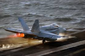 I'd say the 2 shades of grey are to give it a sense of depth, as though the plane is due north, there's sunshine in the west casting a shadow on the east. Remember Chipman said it's open to interpretation,the reason I say the Leaf has a point on the bottom,is its the Jet exhaust and because the Maple Leaf is shaped like a Jet pointing in a downwards direction.I see two Jets in the logo not one. |
|
|
|
Post by DKehler on Jul 24, 2011 11:14:33 GMT -5
Primary logo comes across a bit flat on-screen and on the shirts. It's better on the hat, where there's some texture. Don't really get the pointy end on the maple leaf at the bottom, nor do I get why the jet is two different shades of grey. Do a Google image search on "compass rose" and you will understand. |
|
|
|
Post by Ric O. on Jul 24, 2011 11:20:29 GMT -5
I don't think you're supposed to be seeing the pointy end of a maple leaf. I think it's actually the exhaust of the engines, like this: I'd say the 2 shades of grey are to give it a sense of depth, as though the plane is due north, there's sunshine in the west casting a shadow on the east. Remember Chipman said it's open to interpretation,the reason I say the Leaf has a point on the bottom,is its the Jet exhaust and because the Maple Leaf is shaped like a Jet pointing in a downwards direction.I see two Jets in the logo not one. Sure, it's a form of art so open to interpretation...I didn't really see the leaf as a second jet but now I can see what you're seeing....not a Jet but Jets...and there's exhaust so they must be in motion. Pretty cool. Anyway, it's certainly had a lot more thought go into it than "clip art". |
|
|
|
Post by kingsknight on Jul 25, 2011 11:13:38 GMT -5
some guy over at HF has made a mock up with the new logo. page 35 on the official logo thread. im telling you this, IF they were to use his scheme, then we would have the BEST looking jerseys in the league. hands down! the picture is a home and away side by side. check it out and hopefully someone here can post the pic here too. 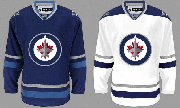 I dunno...look pretty damm sweet to me! PS, I think that's very close to what the actual jersey will be... I came to post these on jetsowner, but it looks like someone beat me to it. By the way, I made these just for fun. I think some news outlets and sites are blowing it out of proportion saying I was trying to trick people into thinking they're the real thing. I'm not, it's just a mockup. article: www.winnipegfreepress.com/breakingnews/cyber-crank-posts-fake-uni-126103008.html |
|
|
|
Post by Brain on Jul 25, 2011 11:16:38 GMT -5
Primary logo comes across a bit flat on-screen and on the shirts. It's better on the hat, where there's some texture. Don't really get the pointy end on the maple leaf at the bottom, nor do I get why the jet is two different shades of grey. Do a Google image search on "compass rose" and you will understand. Was going to say this. It's a compass, essentially. Kind of a neat tie in... The tip of the leaf can be seen as fire behind the jet, or the opposite side of a compass needle. |
|
|
|
Post by DKehler on Jul 25, 2011 11:26:22 GMT -5
I dunno...look pretty damm sweet to me! PS, I think that's very close to what the actual jersey will be... I came to post these on jetsowner, but it looks like someone beat me to it. By the way, I made these just for fun. I think some news outlets and sites are blowing it out of proportion saying I was trying to trick people into thinking they're the real thing. I'm not, it's just a mockup. article: www.winnipegfreepress.com/breakingnews/cyber-crank-posts-fake-uni-126103008.htmlYeah, the Winnipeg Free Press article is just ridiculous. "Cyber crank" my rear end. |
|
|
|
Post by Denny1982 on Jul 25, 2011 12:13:53 GMT -5
Not a big fan of it, it's alright I guess but I want to see the Jersey design before I make my mind up. It could be a nice jersey if done right.
|
|
|
|
Post by johnflushing on Jul 29, 2011 18:26:48 GMT -5
|
|
|
|
Post by The Unknown Poster on Jul 29, 2011 18:31:34 GMT -5
Hmmm, the colour seems off.
|
|
mondo
Veteran Member

Posts: 173
|
Post by mondo on Jul 30, 2011 12:13:07 GMT -5
While I really like the 2 above, some of the other mockups have a horizontal band that goes to the left and right edges of the circle. That seems to add something imo
|
|