IHN
Veteran Member

Posts: 125
|
Post by IHN on Jul 23, 2011 18:05:14 GMT -5
I hate it and wish that they would one day come to their senses and use this logo.  Sweet Jeezus, nooooooo. I prefer the direction True North took. |
|
minam
Prime Member
Posts: 79
|
Post by minam on Jul 23, 2011 22:00:14 GMT -5
|
|
|
|
Post by The Unknown Poster on Jul 23, 2011 22:02:48 GMT -5
Opinions vary but you're flat out wrong. The new logo is ten times better than the above logo made by a fan.
|
|
|
|
Post by Z on Jul 23, 2011 22:06:12 GMT -5
It's easily the best logo in Jets history. Smashing "Winnipeg" and "Jets" into a circle was awkward. This logo needs no text and nothing has to be spelled out. Someone here argued the old Jets had poor marketing, and I agree. The new Jets have already made a more striking presence. +1 The older Jets logos were quite generic. If you verbally described either of the old Jets logos, the original Lightning logo and the NY Islanders logo to someone who's never seen them before, they all sound identical. The Washington Capitals, Buffalo Sabres and old KC Scouts logos followed a similar pattern. 'Start off with a circle, crammed into the circle is the FULL spelled out team name, and a small image representing the nickname'. Remove the circle for Washington, replace the names with pictures for Buffalo and KC. The new logo is an obvious take on the RCAF logo that dates back 70 years or so, plus is subtly a compass pointing to true north. The more I look at it and consider it, the more brilliant I think it is. |
|
|
|
Post by mcguire4 on Jul 23, 2011 22:12:27 GMT -5
some guy over at HF has made a mock up with the new logo. page 35 on the official logo thread. im telling you this, IF they were to use his scheme, then we would have the BEST looking jerseys in the league. hands down!
the picture is a home and away side by side.
check it out and hopefully someone here can post the pic here too.
|
|
|
|
Post by Ric O. on Jul 23, 2011 22:50:12 GMT -5
some guy over at HF has made a mock up with the new logo. page 35 on the official logo thread. im telling you this, IF they were to use his scheme, then we would have the BEST looking jerseys in the league. hands down! the picture is a home and away side by side. check it out and hopefully someone here can post the pic here too. 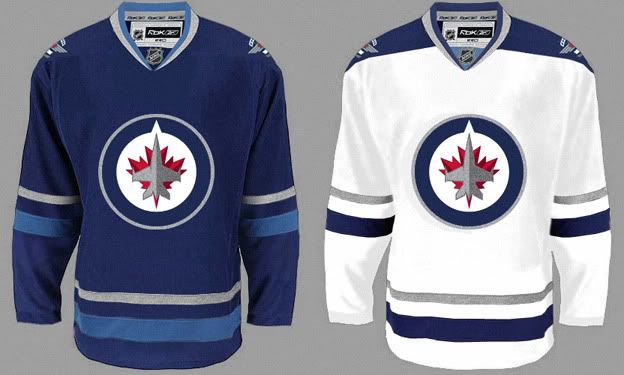 I dunno...look pretty damm sweet to me! PS, I think that's very close to what the actual jersey will be... |
|
|
|
Post by Guardian on Jul 23, 2011 22:58:28 GMT -5
some guy over at HF has made a mock up with the new logo. page 35 on the official logo thread. im telling you this, IF they were to use his scheme, then we would have the BEST looking jerseys in the league. hands down! the picture is a home and away side by side. check it out and hopefully someone here can post the pic here too. I dunno...look pretty damm sweet to me! PS, I think that's very close to what the actual jersey will be... The Blue one is really nice! |
|
|
|
Post by DKehler on Jul 23, 2011 22:59:09 GMT -5
^ I especially like the white one.
|
|
|
|
Post by gobombersgo on Jul 23, 2011 23:00:31 GMT -5
some guy over at HF has made a mock up with the new logo. page 35 on the official logo thread. im telling you this, IF they were to use his scheme, then we would have the BEST looking jerseys in the league. hands down! the picture is a home and away side by side. check it out and hopefully someone here can post the pic here too. I dunno...look pretty damm sweet to me! PS, I think that's very close to what the actual jersey will be... These kick the crap out of any mock up jersey I have seen to date. These are awesome! |
|
|
|
Post by Bobster231 on Jul 23, 2011 23:05:54 GMT -5
I dunno...look pretty damm sweet to me! PS, I think that's very close to what the actual jersey will be... The Blue one is really nice! Those are amazing jerseys... WOW. Just wow. |
|
|
|
Post by 22Neufeld28 on Jul 23, 2011 23:07:33 GMT -5
I find the home ones a little drab,maybe the silver bands could be replaced with white.
But what I would really like,is for the home ones to use the roundel,and the road ones using the wing logo.Other teams use diff jerseys for home and away,I wonder if TN maybe thinking of this.It would help in selling more merch I would think.
|
|
|
|
Post by Ric O. on Jul 23, 2011 23:18:55 GMT -5
I find the home ones a little drab,maybe the silver bands could be replaced with white. But what I would really like,is for the home ones to use the roundel,and the road ones using the wing logo.Other teams use diff jerseys for home and away,I wonder if TN maybe thinking of this.It would help in selling more merch I would think. You lost me at "drab"... |
|
|
|
Post by WavyGravy on Jul 23, 2011 23:37:07 GMT -5
hate it, its actually so bad     This fan did a way better job. The new logo is just terrible. Your joking.. This is the biggest piece of crap. Looks like someone made it in Word. An italicized W with a jet and contrail. I've seen better beer league logos |
|
|
|
Post by WavyGravy on Jul 23, 2011 23:40:39 GMT -5
some guy over at HF has made a mock up with the new logo. page 35 on the official logo thread. im telling you this, IF they were to use his scheme, then we would have the BEST looking jerseys in the league. hands down! the picture is a home and away side by side. check it out and hopefully someone here can post the pic here too. These are fantastic!! I dunno...look pretty damm sweet to me! PS, I think that's very close to what the actual jersey will be... |
|
|
|
Post by flippy on Jul 23, 2011 23:45:27 GMT -5
Primary logo comes across a bit flat on-screen and on the shirts. It's better on the hat, where there's some texture. Don't really get the pointy end on the maple leaf at the bottom, nor do I get why the jet is two different shades of grey.
Secondary logo should be the primary - a great typeface, nice balance to it.
Wordmark is brutal - looks like the Jays font with a giant maple leaf thrown in there. If the players' names on the back of the jerseys are in that font, it will completely ruin what will otherwise be a pretty sharp look.
Overall, it's still better than any fan mock-up I've seen here or anywhere else. The military influence is a bit over the top, but it doesn't bother me a ton.
|
|
|
|
Post by Hobble on Jul 23, 2011 23:54:24 GMT -5
Just think of the MTSC filled with those white jerseys during a Whiteout... hot damn... Can't wait.
|
|
|
|
Post by USArizona on Jul 24, 2011 0:00:15 GMT -5
The blue one rocks! Nice logo!
|
|
|
|
Post by Ric O. on Jul 24, 2011 0:01:24 GMT -5
Don't really get the pointy end on the maple leaf at the bottom, nor do I get why the jet is two different shades of grey. I don't think you're supposed to be seeing the pointy end of a maple leaf. I think it's actually the exhaust of the engines, like this: 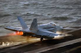 I'd say the 2 shades of grey are to give it a sense of depth, as though the plane is due north, there's sunshine in the west casting a shadow on the east. |
|
|
|
Post by jjmoohead on Jul 24, 2011 0:03:24 GMT -5
some guy over at HF has made a mock up with the new logo. page 35 on the official logo thread. im telling you this, IF they were to use his scheme, then we would have the BEST looking jerseys in the league. hands down! the picture is a home and away side by side. check it out and hopefully someone here can post the pic here too. I dunno...look pretty damm sweet to me! PS, I think that's very close to what the actual jersey will be...[/quote Wow! Those Jerseys kick some Go Jets Go! Makes that logo really standout in the greatness that it is. |
|
|
|
Post by toddhamilton on Jul 24, 2011 0:33:32 GMT -5
loser's hate things that are awesome ;D |
|