|
|
Post by enarwpg on Jul 22, 2011 19:04:48 GMT -5
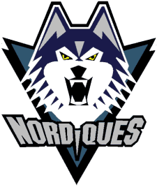
Pretty basic, yay or nay?  ........................ ^^LOVE IT^^....................................... ^^this FONT sucks ^^ |
|
|
|
Post by enarwpg on Jul 22, 2011 19:06:19 GMT -5
I'm very disappointed. It's jut some boring colors, clipart logo, and a maple leaf just like Toronto....well of course you don't like it.... you like the Rangers ! |
|
|
|
Post by jjmoohead on Jul 22, 2011 19:13:05 GMT -5
Actually its not like Toronto at all. Although if you are going there may as well say Its just like the bruins cause it has a circle. sigh... Only 9 people are unsure or dislike out of 132. The people have spoken, its time to let it grow on you and stop crying. not necessarily, they're not called the "Boston Circles". This is taking the entire leafs' logo and putting a jet over it. and you're telling me to stop complaining 10 minutes after I see it? that argument would be valid if it had been a week after it was released. Its not called the Winnipeg Maple Leafs either so my point still stands. My second point was also not at you directly, thus the space between. here is one more point though. Take some time to actually look at the new logo, then take some time and look at the leafs logo. Notice anything different about the maple leaf you are so freaking worried about? Let me help you since you clearly can't see beyond your blindness. 1) The obvious - Our leaf is red - SHOCKER! 2) The not so obvious but should be noticeable - Our leaf is detailed 3) The not obvious - Look at the bottom of the leaf, - nothing like the TML logo 4) The ridiculous on your part - THERE IS SO MUCH MORE GOING ON (Circles, Rings, Compass Point) OMG ITS JUST THE LEAFS LOGO WITH A JET ON TOP. PLEASE!!!! |
|
|
|
Post by 22Neufeld28 on Jul 22, 2011 19:25:43 GMT -5
I'm very disappointed. It's jut some boring colors, clipart logo, and a maple leaf just like Toronto....well of course you don't like it.... you like the Rangers ! Well he has to admit its better then the Rangers logo,wait does spelling out the words "New York"or "Rangers" even count as a logo-lol |
|
|
|
Post by folix on Jul 22, 2011 19:56:08 GMT -5
I thought it was "good" then when I saw it on a hat, I was thinking, no it's very good, I think most people will love it on the jersey.
|
|
|
|
Post by jpjets15 on Jul 22, 2011 20:00:38 GMT -5
def nay on the primary. secondary has a nice touch to it. that shoulder patch should have been the main logoX2. |
|
|
|
Post by bigboss113 on Jul 22, 2011 20:17:49 GMT -5
As i look at the logo more and more it has grown on me very fast and i like it very much now, took some getting used to but now im at an all time high, love the new logo and team we are getting. Things have finally warmed up in winnipeg, no pun intended, the wheather has been amazing.
|
|
|
|
Post by cheswick on Jul 22, 2011 20:30:53 GMT -5
its alright. i find the notch on the top awkward and the way the jet blocks the leaf makes the leaf look weird.
shoulder patch is perfect
|
|
|
|
Post by inkymarx on Jul 22, 2011 20:37:16 GMT -5
I don't like it but i don't hate it.... reminds me to much of the logo for the royal canadian legion.
I do however think the color scheme on the winnipeg jets NHL website looks good (silver / dark blue / light blue stripe).... I am looking forward to seeing a full jersey with the logo and colors on it.
|
|
|
|
Post by pateramus on Jul 22, 2011 20:39:15 GMT -5
I love the 2nd one, first is good, the third (word Jets) doesn't seem to have the authority it should with the cursive writing, I would have preferred a more metallic straight cut capital letters wording.
I love the the military association to this. There are so many possibilities with this. It is awesome.
|
|
|
|
Post by buffaloboy44 on Jul 22, 2011 20:45:17 GMT -5
its okay - I guess because it took so long to be unveiled I was expecting to be blown away, which I wasn't, still got our team back so doesn't really matter in the overall scheme of things!
|
|
egg16
Prime Member

Posts: 85
|
Post by egg16 on Jul 22, 2011 20:47:23 GMT -5
its alright. i find the notch on the top awkward and the way the jet blocks the leaf makes the leaf look weird. shoulder patch is perfect I don't mind the notch at the top of the circle but I do agree that the way the top of the jet eclipses the top point of the maple leaf makes it looks not quite right -- especially when there is red at the bottom of the jet and the leaf but not at the top. I have read several comments on the WFP site from people wondering why the maple leaf is upside down. I kind of chuckled about it at first and wondered what the heck they were looking at but then, when I showed it to my 10-year-old son for the first time, the first thing out of his mouth was "why is the maple leaf upside down?". I don't see it that way myself but I guess, to some, the lack of red at the top and the red point at the bottom create the illusion that it is upside down. Overall I'm okay with the logo and am very glad it wasn't anything too complex or cartoony. Maybe a thin red outline on the top point of the jet would help complete the image of the maple leaf though. |
|
|
|
Post by codamatic22 on Jul 22, 2011 20:47:50 GMT -5
I really love it. you should go to TSN and look at the comments i don't think many jerseys will sell outside of Manitoba
|
|
|
|
Post by drumzan on Jul 22, 2011 21:11:02 GMT -5
2 Billion times nay. The primary logo looks like some 10 year old kid designed it in MS Paint 97. I wish they would've went with the design from that guy in England. I'm sticking with my retro Jets jersey.
|
|
|
|
Post by jets2010 on Jul 22, 2011 21:11:39 GMT -5
Like it. have to say though, it'll look Beast on the Centre Ice circle. CAN'T WAIT ;D
|
|
|
|
Post by Bobster231 on Jul 22, 2011 21:14:00 GMT -5
2 Billion times nay. The primary logo looks like some 10 year old kid designed it in MS Paint 97. I wish they would've went with the design from that guy in England. I'm sticking with my retro Jets jersey. Actually, it's very nice and clever and well designed. I love it. |
|
|
|
Post by Douggy-D on Jul 22, 2011 21:37:03 GMT -5
It's alright, it could've been better. I think it should've looked more like the Jets logos of old. I saw better proposals for logos out there.
|
|
|
|
Post by thanatos on Jul 22, 2011 21:54:52 GMT -5
Give it a week or two, people will come around. We got the jets; don't like the logo? w.e fuhgetaboutit.
|
|
|
|
Post by Ric O. on Jul 22, 2011 22:18:17 GMT -5
I really love it. you should go to TSN and look at the comments i don't think many jerseys will sell outside of Manitoba meh, people used to laugh at the Penguins logo too...now it's a classic. EDIT: as of now with over 13,000 votes cast over 60% like the logo. |
|
dcfalk
Veteran Member
Posts: 170
|
Post by dcfalk on Jul 22, 2011 22:19:57 GMT -5
count me as one guy out of Manitoba that's buying a jersey
|
|