|
|
Post by Conky on Jun 20, 2011 13:26:04 GMT -5
the Royals! ;D 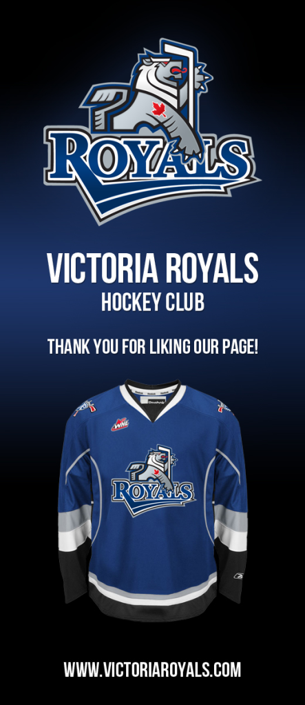 Hopefully the first of many team name announcements this week. |
|
|
|
Post by Comrade Fox on Jun 20, 2011 13:27:15 GMT -5
I like the colors, name, and main logo, but the wordmark looks like WordArt.
|
|
|
|
Post by jungles on Jun 20, 2011 13:28:23 GMT -5
Hate the logo. Love the colors.
|
|
|
|
Post by hui432102 on Jun 20, 2011 13:29:02 GMT -5
I like the logo very much
|
|
|
|
Post by M.C. Molineux on Jun 20, 2011 13:29:16 GMT -5
I like it all, but I don't like how they have the exact same colours as the Saint John Seadogs, current CHL champions.  |
|
|
|
Post by 22moemantha on Jun 20, 2011 13:36:34 GMT -5
The Victoria Jersey design is nicer though  |
|
|
|
Post by postmanpat on Jun 20, 2011 13:43:15 GMT -5
I like. The logo looks all 'coat of arms'-ish, which I find interesting.
|
|
|
|
Post by djk on Jun 20, 2011 13:45:01 GMT -5
Besides, St John is in the Q and Victoria in the WHL so they won't ever meet except in the Mem Cup and the odds for that can't be all that high.
|
|
|
|
Post by shtinky on Jun 20, 2011 13:47:18 GMT -5
I like the colors, name, and main logo, but the wordmark looks like WordArt. Agree. The jersey always looks better when you leave the wordmark off of it. Just let the logo speak for itself. Also, does every Canadian team really need to have the maple leaf plonked on it? Victoria is in Canada, we get it. |
|
|
|
Post by Dante_X on Jun 20, 2011 13:49:09 GMT -5
jersey is simply the Lightning alternate "Bolts" jersey
|
|
|
|
Post by jetsorbust on Jun 20, 2011 14:03:03 GMT -5
I like the colors, name, and main logo, but the wordmark looks like WordArt. Agree. The jersey always looks better when you leave the wordmark off of it. Just let the logo speak for itself. Also, does every Canadian team really need to have the maple leaf plonked on it? Victoria is in Canada, we get it. I agree about the logo being better without the wordmark in most cases. I have to disagree about the Maple Leaf though. I love seeing a maple leaf, so anywhere you can fit one in it works for me! Obviously I'm not so sure about it as the main logo but I like seeing it fit into a logo. |
|
|
|
Post by Conky on Jun 20, 2011 14:05:06 GMT -5
Agree. The jersey always looks better when you leave the wordmark off of it. Just let the logo speak for itself. Also, does every Canadian team really need to have the maple leaf plonked on it? Victoria is in Canada, we get it. I agree about the logo being better without the wordmark in most cases. I have to disagree about the Maple Leaf though. I love seeing a maple leaf, so anywhere you can fit one in it works for me! Obviously I'm not so sure about it as the main logo but I like seeing it fit into a logo. They should just save them for alternate logos and shoulder patches. |
|
|
|
Post by killemall83 on Jun 20, 2011 14:12:37 GMT -5
They took the exact design of the Tampa Bay Lightning's 3rd and just slapped a logo on it. Meh.  |
|
|
|
Post by jetsorbust on Jun 20, 2011 14:14:50 GMT -5
I agree about the logo being better without the wordmark in most cases. I have to disagree about the Maple Leaf though. I love seeing a maple leaf, so anywhere you can fit one in it works for me! Obviously I'm not so sure about it as the main logo but I like seeing it fit into a logo. They should just save them for alternate logos and shoulder patches. Yeah I wouldn't mind that. Ever since I first saw it, I've always thought this would make a GREAT shoulder patch:  It's amazing in my opinion, I like it as a jersey even I just have to admit it's too close to the leafs to be a main logo. But it looks freaking awesome. |
|
|
|
Post by Conky on Jun 20, 2011 14:24:41 GMT -5
They should just save them for alternate logos and shoulder patches. Yeah I wouldn't mind that. Ever since I first saw it, I've always thought this would make a GREAT shoulder patch: It's amazing in my opinion, I like it as a jersey even I just have to admit it's too close to the leafs to be a main logo. But it looks freaking awesome. It's not bad.. but it makes me want to go curling. That as a shoulder patch or third jersey would be perfect. |
|
|
|
Post by bannedana204 on Jun 20, 2011 14:31:42 GMT -5
I don't know why, but the Canadian Maple Leaf featured in the logo just kills the whole thing.
Blech.
|
|
|
|
Post by canadiensfan on Jun 20, 2011 14:33:43 GMT -5
They should've gone with a brighter color scheme. While red and gold might have been an obvious choice, it would've worked much better and looked much better, IMO. I'll still be following them regardless.
|
|
|
|
Post by lilratzy on Jun 20, 2011 14:35:30 GMT -5
I don't like the whole maple leaf thing. Yes, we are Canadian, we all know it, lets celebrate the city/province and leave the maple leaf to a team that hasn't won since 67'
|
|
|
|
Post by Dcmac on Jun 20, 2011 14:41:19 GMT -5
I think the actual logo is too small not to have some sort of wordmark on it, but I like the design and colours.
|
|
|
|
Post by shtinky on Jun 20, 2011 15:39:51 GMT -5
I think the actual logo is too small not to have some sort of wordmark on it, but I like the design and colours. Just make the logo bigger. Problem solved. |
|