|
|
Post by sab177 on May 21, 2011 22:17:04 GMT -5
When I first came to this site years ago, I thought the Jets logo that Darren Ford had created was awesome. I think it would be great if this logo could be used for the team, if indeed they become the Jets again, which I hope they will.
Its new, its fresh, it looks awesome. This could be the new logo with the traditional Jets logo as an alternate.
Just my thoughts. What about yours?
|
|
|
|
Post by roccerfeller on May 21, 2011 22:23:56 GMT -5
Well, its actually a portion and done up logo from the design used before the "modern" Jets logo (the last design used before they left Winnipeg)
Do a google image search and you'll see what I mean (or look at the Jets logo in my avatar)
So technically it is a traditional logo. Whoever designed it, whether it was DF or someone he got to design it, did do a good job though.
|
|
|
|
Post by Ric O. on May 21, 2011 22:26:52 GMT -5
When I first came to this site years ago, I thought the Jets logo that Darren Ford had created was awesome. I think it would be great if this logo could be used for the team, if indeed they become the Jets again, which I hope they will. Its new, its fresh, it looks awesome. This could be the new logo with the traditional Jets logo as an alternate. Just my thoughts. What about yours? If they have a change of heart and go with the name Jets, that logo wouldn't be my choice. I like it, but I've seen some other really cool ones out there over the years. |
|
|
|
Post by tp2005 on May 21, 2011 22:27:09 GMT -5
This is by far-and-away my favorite logo if they a renamed the Jets: 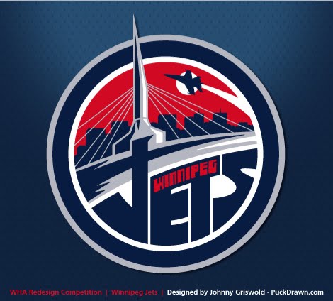 And this is my favorite if they happen to be called the Falcons: 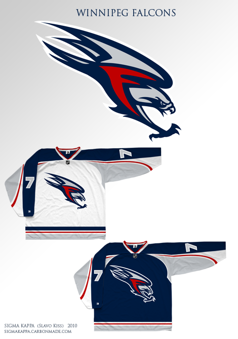 |
|
|
|
Post by Ric O. on May 21, 2011 22:29:04 GMT -5
Yeah I really like that Jets logo a lot.
The Falcons one not so much (although it looks quite professionally done)
|
|
|
|
Post by Either_Or on May 21, 2011 22:29:10 GMT -5
Bless Darren...but, in my opinion that logo is terrible...It's a passenger jet.
|
|
|
|
Post by hui43210 on May 21, 2011 22:30:08 GMT -5
Bless Darren...but, in my opinion that logo is terrible...It's a passenger jet. X2 |
|
|
|
Post by tp2005 on May 21, 2011 22:30:40 GMT -5
Yeah I really like that Jets logo a lot. The Falcons one not so much (although it looks quite professionally done) I would like to see that Jets logo I posted on those "Falcons" jerseys! |
|
|
|
Post by sab177 on May 21, 2011 22:33:11 GMT -5
I know what you mean roccer, but I like the ROTJ logo by itself as a fresh (albeit not new) look.
I have also seen a lot of good new logos out there Ric O, but I still feel the ROTJ was the best. Feel free to post any others for comparsion.
|
|
|
|
Post by sab177 on May 21, 2011 22:38:33 GMT -5
and I'm not sure if that's a red moon behind it, or exactly what it is supposed to represent... Sorry DF, no disrespect. hmm, I'm a little surprised at the opinions here. I think it looks stylish, sleek, and simple. And how dare you criticize The Ford. You should be ashamed.  |
|
|
|
Post by Either_Or on May 21, 2011 22:41:56 GMT -5
That's the fun of art...Everyone has the right to an opinion...
I do design for a living, so I guess I can be pretty anal...
I just think a Jet for a sports team should be a little more aggresive than a passenger plane.
|
|
|
|
Post by Thruster on May 21, 2011 22:42:00 GMT -5
|
|
|
|
Post by repoman27 on May 21, 2011 22:46:19 GMT -5
Bless Darren...but, in my opinion that logo is terrible...It's a passenger jet. Yup, agreed. |
|
tonyng
Rookie Member
 Your 2011/12 Stanley Cup champions
Posts: 10 
|
Post by tonyng on May 21, 2011 22:58:08 GMT -5
Agree to use Darren's logo as the new logo
The one posted by tp2005 is also good, though might be a bit complex compared to other NHL logos
The Falcons one has some similarities with the Capitals' eagle some years back
|
|
|
|
Post by bannedana204 on May 21, 2011 23:00:12 GMT -5
I certainly hope not.... that ROTJ logo is the WORST.
|
|
|
|
Post by iliketherangers on May 21, 2011 23:03:24 GMT -5
And this is my favorite if they happen to be called the Falcons: that logo looks exactly like the capitals logo expect it's flipped and different colors. DOn't name them the falcons!!!!!! Attachments:
|
|
|
|
Post by bromine on May 21, 2011 23:04:38 GMT -5
This one is my favourite by far. I think a slight adjustment with some light blue as a nod to the old thrashers franchise and you've got a winner. Bust out the old Jets jerseys for retro night. This logo is different from the same old wordmark but still a nod to the old team. A new mark for a new generation of Jets team. GREAT logo, IMO. Found it on Chris Creamer's site. Made by DGNMRWRW.   More logo discussion here: returnofthejets.proboards.com/index.cgi?board=OffTopic&action=display&thread=10283 |
|
|
|
Post by iliketherangers on May 21, 2011 23:07:02 GMT -5
^^^^^^ for some reason it reminds me way too much of USA's jersey design.
|
|
|
|
Post by bromine on May 21, 2011 23:10:32 GMT -5
Maybe a bit.. A great secondary wordmark would include a stylized province of MB outline.
|
|
|
|
Post by CuJo31 on May 21, 2011 23:16:05 GMT -5
|
|