dcfalk
Veteran Member

Posts: 170
|
Post by dcfalk on Jul 22, 2011 18:13:38 GMT -5
I like the powder blue stripe on the dark and the red on the white
|
|
sennin
Rookie Member
Posts: 31
|
Post by sennin on Jul 22, 2011 18:16:59 GMT -5
I like the powder blue stripe on the dark and the red on the white Ya I agree. Lovin the powder blue on the home, hope they use it! |
|
|
|
Post by 22Neufeld28 on Jul 22, 2011 19:03:13 GMT -5
I wonder if the "notch" will have something like the arrow-point in the TNSE logo. I keep hearing that the notch will look like some kind of compass point, so maybe it has something like this at the top:  Edit: Maybe something like this in silver? (it's subtle) 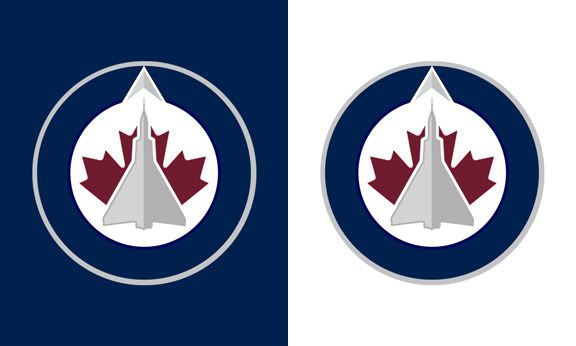 Just going through some of these posts from the past little while,and getting a laugh at some posters.If they had done something like this with the notch,I think it would have looked 10 times better,its the little things that count.But its the first logo,I expect some tweaking to be going on in the near future or after season one. |
|
doig
Rookie Member
Posts: 7
|
Post by doig on Jul 22, 2011 20:07:47 GMT -5
The line at MTS Centre is now closed. Everyone in line guaranteed to get into store. Even if it's past 10.
#phewjustmadeit
|
|
|
|
Post by CravenMoorhead on Jul 22, 2011 20:11:19 GMT -5
 like that? Sennin, you are a genious! Those are beautiful jerseys. Did you do that yourself? |
|
sennin
Rookie Member
Posts: 31
|
Post by sennin on Jul 22, 2011 20:14:15 GMT -5
like that? Sennin, you are a genious! Those are beautiful jerseys. Did you do that yourself? Yup  Thanks lol. I just realized that the shoulder stripes are backwards, oops |
|
|
|
Post by CravenMoorhead on Jul 22, 2011 20:16:37 GMT -5
I like it. It reminds me of a modern Jets uniform, but classic at the same time.
|
|
|
|
Post by hacky666 on Jul 22, 2011 20:38:59 GMT -5
I hope they go with a more "maroon'ish" colour. Attachments:
|
|
nrg21
Rookie Member
Posts: 7
|
Post by nrg21 on Jul 23, 2011 20:40:39 GMT -5
i like red Attachments:
|
|
|
|
Post by livethedream on Jul 23, 2011 20:45:07 GMT -5
|
|
|
|
Post by Z on Jul 23, 2011 21:52:50 GMT -5
Based on the "stripes" on the website background. I predict the jerseys will be something like this  I reallly like the white. I wasnt a huge fan of the logo, but its def growing on me and really looks good with the correct jersey layout I hope they stick to something like this. The lack of red in the stripes makes the logo itself stand out more. Way better than the same mock up using red instead of powder blue. |
|
|
|
Post by mcguire4 on Jul 23, 2011 22:14:32 GMT -5
page 35 in the offical logo thread at HF......JUST GO LOOK AT THOSE BEAUTIES!!!
|
|
|
|
Post by Guardian on Jul 23, 2011 23:03:34 GMT -5
page 35 in the offical logo thread at HF......JUST GO LOOK AT THOSE BEAUTIES!!! I agree!!! |
|
|
|
Post by Ric O. on Jul 23, 2011 23:05:32 GMT -5
|
|
|
|
Post by shyguyjay on Jul 24, 2011 0:03:59 GMT -5
Let the record reflect I have no inside knowledge of what the jerseys might look like and this is just a composite I put together in 10 minutes. Attachments:
|
|
johnd
Veteran Member
Thank you TNSE!
Posts: 228
|
Post by johnd on Jul 24, 2011 0:09:40 GMT -5
Very nice.
|
|
|
|
Post by jjmoohead on Jul 24, 2011 1:07:50 GMT -5
Seen this over at HFBoards. Figured I would bring it here for others to look at.  |
|
|
|
Post by 71malone on Jul 24, 2011 1:14:12 GMT -5
page 35 in the offical logo thread at HF......JUST GO LOOK AT THOSE BEAUTIES!!! Please post a link when you reference another site. ;-) |
|
|
|
Post by mcguire4 on Jul 24, 2011 1:20:14 GMT -5
page 35 in the offical logo thread at HF......JUST GO LOOK AT THOSE BEAUTIES!!! Please post a link when you reference another site. ;-) BOOM! ;D well played. |
|


 Thanks lol. I just realized that the shoulder stripes are backwards, oops